

Grandma Tech
An engaging web platform to teach the elderly how to use apps
GrandmaTech started from InterGenerations, a social impact initiative by UXLeris in which volunteers, including myself, taught the elderly to use mobile apps through weekly in-person classes. However, many elders struggled to retain information between classes, and the program was limited to one city. To address this, Luciana Zaina, head of UXLeris, decided to create an online platform with video lessons, allowing the elderly to revisit topics and expanding the project's reach.
OVERVIEW
CLIENT
UXLeris
TIMELINE
4 months (Aug - Dec 2019)
Sofia Silveira (me), Product Designer
Lucas Penteado, Developer
PLATFORM
Web (mobile-first)
TEAM
— End-to-end design process
— Develop design concept
— Design gamification
— Create brand identity
— Work with developer
— Communicate with client
RESPONSIBILITIES
How might we help elderly people in Brazil understand how to use their phones so that they can leverage technology to stay connected to loved ones and improve their daily lives?
PROBLEM
Many elderly people in Brazil want to keep in touch with their friends, to take photos and post them on social media, to message their families, to schedule appointments on their calendar, among others. Although they have mobile phones and want to use them for these tasks, they don’t know how to properly use their phones, but they want to learn.
High-level goals of the project
GOALS
01
Provide easy access to video lessons on different topics related to mobile apps
02
Help the elderly practice what they learned by answering quizzes related to each video lesson
Leverage gamification to motivate the elderly and make the learning process more interesting
03
Grandma Tech was successfully launched in early 2020
OUTCOMES
Participants were able to finish all tasks in the usability test
83%
Quiz questions created for all video lessons based on 3 question models
205
100%
Participants felt highly satisfied and engaged, rating their experience 8 or 9 out of 9 on the SAM questionnaire
67%
Participants felt moderate to high control, rating their experience 5 or 9 out of 9 on the SAM questionnaire
Although further testing had been scheduled to assess the application's performance and user adoption, the onset of the COVID-19 pandemic prevented its conduction.

Understanding the users and extracting insigts
USER RESEARCH
— Some elderly feel intimidated by technology, so the application must be simple, inviting and easy to use
— The elderly tend to use mobile phones and tablets more than computers, so the application design and development should follow a mobile-first approach
— Some elderly have difficulty clicking on buttons, especially if they are not big enough and if the elderly are using smaller screens, therefore the application buttons must be big and easily clickable (Fitt’s Law)
Ethnography takeaways

— The elderly have difficulty reading on mobile phones, especially text in smaller fonts, hence the application should not contain too much text and the text font should be big
— The elderly have difficulty seeing small images or videos on their phones, so having large images/illustrations and being able to expand the videos to a full-screen is essential
Secondary data takeaways

— The client expects the application to be a complement to the InterGenerations project, displaying video lessons recorded by the InterGenerations volunteers
— The video lessons should be grouped into different categories depending on the app they explain about, e.g. Facebook, Camera
— The application design should include both the end-user and the content management (not shown here) parts of the system
Client requests

Defining system requirements
REQUIREMENTS
Considering the elderly use solely their mobile phone, the application must be designed and developed following a mobile-first approach, with an initial focus on smaller screens, which have more restrictions, and later the system functionalities were expanded to fit bigger screens, like computers.
-
the system must display the video lessons recorded by the InterGenerations volunteers
the system must group the video lessons by category
the system must have big easy-to-reach buttons
the system must display text in big fonts
the system must have a walkthrough guide to help users understand how to use the app
the system must display a message automatically after the video ends inviting users to answer a quiz
the system must display a message notifying users when they reach a new level
-
the system must present a quiz with questions related to each video lesson
the system must have at least 2 different quiz question models
the system must allow users to answer the quiz before finishing the video lesson by pausing the video
the system must hide from the quiz questions that have been answered correctly
the system must allow users to answer again questions they have answered incorrectly
the system must classify users by level of knowledge
-
the system must allow users to sign up with an email account
the system must allow users to delete their account
the system must allow users to sign into the app
-
the system must allow the app admin to sign into the system
the system must be able to CRUD (create, read, update and delete) a quiz following one of the defined models
the system must be able to CRUD (create, read, update and delete) a video lesson
the system must be able to CRUD (create, read, update and delete) a category
Planning the application structure
SITEMAP

On the homepage, users can browse the list of categories. After selecting a category, they are taken to the category page. After choosing a video lesson, they go to the video lesson page. There are multiple category pages, one for each category (app). Similarly, there are multiple video lesson pages, one for each video lesson in each category.
Main flow
The app walkthrough is shown when users access the platform for the first time and can also be accessed through the menu. This guide is a series of modals that explain how to use and navigate the platform.
Walkthrough guide
Users can access their account page to check their current level, their progress, such as percentage of questions answered correctly, and can delete their account.
Account page
Building wireframes of the main screens
WIREFRAMING
I aimed to create a very simple and intuitive interfaces and although it would be ideal to use divergent thinking and consider different possibilities at this point, the time and resources we had available did not allow for much exploration.

Homepage
Aiming to create a simple and inviting interface, the homepage already lists all the categories (apps) of video lessons. Each category should be represented by a big and easily clickable rectangle, including an easily readable category title, big icon and progress bar of completed video lessons to motivate the elderly to keep learning. After selecting the category they want to learn about, users are taken to the category page.

Category page
To reduce cognitive load, each category is broken down into short video lessons covering different tasks that can be done in the app (chosen category). The category page contains a list of video lessons in that category. Each video lesson is represented by a clickable thumbnail of the video, and its title and duration aiming to help in the decision process, written in high contrasting colours for easy legibility.
Video lesson page
The video lesson page contains the YouTube embedded video lesson recorded by the InterGenerations volunteers. To reduce user effort and provide an intuitive experience, once users hit play, the video automatically becomes full screen and users only need to turn their phones horizontally. When the video lesson is finished or paused, it goes back to the original size and below it appears a message prompting users to answer the quiz questions, so they easily understand what the next step is.
Mid-fidelity prototypes for proof of concept
PROTOTYPING
I then elaborated medium-fidelity wireframes and created prototypes in Figma in order to conduct a concept test with a few participants to evaluate the feasibility and appeal of this possible version of the application.
The screens shown below were translated to English for better comprehension of this case study.

Menu

Homepage

Category page

Video lesson page
I conducted a focus group with 3 participants from the InterGenerations project and the main takeaways were:
— The elderly quickly grasped the idea of the application and said it was appealing and intriguing to them
— They did not understand that the "hamburger" icon represents a menu, so I replaced by the word "Menu"
— Presenting all categories as menu options felt confusing to them, so I kept them only on the homepage
— The elderly pointed out there was too much to pay attention to on the Category page. I removed the length indication of each video lesson and increase the white space
Concept Testing

Creating the brand visual identity
BRAND IDENTITY


When creating the colour palette, I chose a blue-green colour as the primary brand colour (#3E9B8A). In Brazil, this colour is often associated with sea water, evoking a sense of tranquility, renewal and growth. The aim was to create a calming and welcoming environment for the elderly, encouraging them to feel safe and confident in their learning journey.
Colour Palette

The logo had to be representative of our target audience and had to look friendly, so I created a logo with an illustration of an elderly woman inside the screen of a phone or tablet. The grandma illustration includes different tones of the primary brand colour and rounded shapes, making grandma look cute and affectionate, like a friend for the elderly.
Logo
Considering the idea of using the grandma illustration was to make the app feel inviting and to engage the elderly, I decided to use variations of the illustration to communicate with the users in different parts of the application.
Besides the logo, the grandma illustration was used in different ways through the app:
Grandma illustrations
-
![]()
App Walkthrough
Grandma should appear in the app guide, pointing to on-screen elements to help users understand how to use the app.
-
![]()
Quiz Feedback (Correct)
Grandma should appear smiling after each correctly answered question to provide feedback to the users.
-
![]()
Quiz Feedback (Incorrect)
Grandma should appear sad after each incorrectly answered question to provide feedback to the users.
-
![]()
Start Quiz
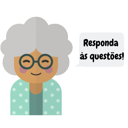
Grandma should appear when users finish watching or pause the video lesson, prompting them to start the quiz.
-
![]()
End Quiz
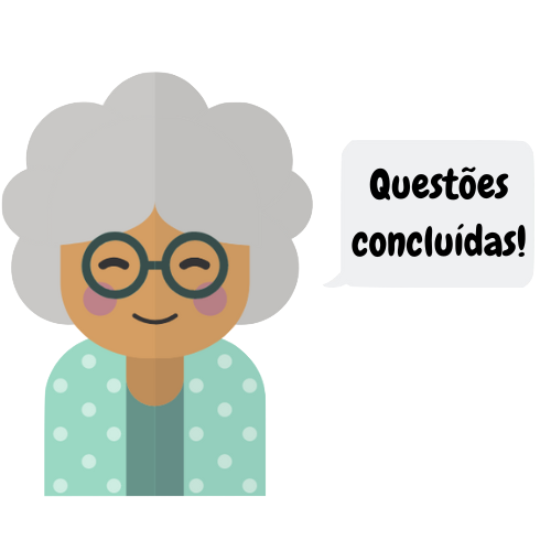
Grandma should appear at the end of the quiz to let users know they've finished answering all the questions.
-
![]()
Back to Quiz
When users return to a video lesson, Grandma should appear to let them know they have already answered all the questions.
-
![]()
New Questions
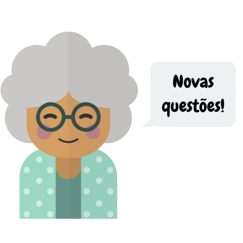
Grandma should appear after the video lesson ends or is paused to inform users that new questions have been added.


Creating gamification elements to engage and motivate the elderly
GAMIFICATION
As many elders tend to feel intimidated by the complexity of their phone, I decided to use gamification to make the learning process more fun and engaging for them. The gamification elements used in Grandma Tech include quizzes after each video lesson, progressive milestones with different levels and “prizes”, progress bars in each category and on My Account page and feedback messages.
As the elderly answer quiz questions correctly, they reach higher levels. Each of the 5 levels are represented by a different “prize”, ranging from a ribbon to a trophy.
Levels

Level 1

Level 2

Level 3

Level 4

Level 5
I created 3 question models:
— Alternative: is a multiple choice model question in which users must select only one option (text or image) that best answers the question
— Sequence: is a question model in which users must select the right order in which the described steps should be done to perform a task
— Pairs: is a question model in which users must select the correct pairs of icons/concepts and their meanings
Based on these models, I elaborated a few questions for each of the video lessons, totalizing 205 quiz questions.
Quiz question models
Alternative
Sequence
Pairs
From high-fidelity designs to development
SOLUTION
I then created high-fidelity wireframes of the app and started working with Lucas, the developer, to bring the designs to life as a fully functional web application.
Sign in Page
Walkthrough Guide
Home Page
Menu
Category Page
Video Lesson Page
Video Lesson Page (Quiz)
My Account Page
After the system was developed, I conducted a user testing session with 6 elderly. To avoid collecting biased results due to familiarity with the application, the elderly doing the testing were not the same participants who did the concept testing with mid-fidelity prototypes and had not seen the application before.
Usability testing and SAM post-test
TESTING
For the Usability Test, I used the Think Aloud technique, asking the elderly to verbalize their thoughts as they tried to complete the tasks. The test included 5 tasks:
Usability Testing
Create an account and sign in
Task 1
Read walkthrough guide
Task 2
Watch lesson “How to post on Instagram stories”
Task 3
Task 4
Answer quiz questions
Check the total of questions answered on my account page
Task 5
83% of the participants were able to finish all the 5 tasks. The tasks in which the elderly faced more difficulty and, consequently, took longer to complete were Task 3 and Task 5. Only small details needed to be changed in order to solve some difficulties observed while the elderly interacted with the application.
As a post-test, I applied the SAM questionnaire to measure the emotional response of the elderly to the system.
The questionnaire evaluated 3 aspects:
— Pleasure: their satisfaction and emotion while using the application
— Arousal: their motivation and excitement while using the application
— Dominance: their sense of control over the system
The answers obtained from the questionnaire were positive and showed that the elderly liked the application and felt good and excited when using it. Although some participants did not feel in control over the system, mainly because it was the first time they interacted with it, all of them showed a high level of motivation, curiosity and happiness, wanting to find out more about the application and start playing with it right away.
Self-Assessment Manikin (SAM)

By following a user-centered approach and focusing on users since the beginning of the project, it was possible to understand early on that the elderly were not familiar with some aspects of technology that are commonly understood by other types of users, including the hamburger menu icon. The elderly did not know they were supposed to click on it in order to see all menu options. That emphasized the importance of co-designing with users and focusing on them throughout the whole design process.
Learnability
One thing that I would change is instead of just using the word ‘menu’, I would keep both the hamburger menu icon and the word ‘menu’, as it would allow the elderly to learn and associate the icon with its meaning, which is important considering the hamburger menu icon is used in many websites and apps.
Accessibility
Moreover, looking back at this project, I realized that the primary color I chose (#3E9B8A) did not meet accessibility contrast standards for normal text against a white background. While this color wasn’t heavily used in the application, I now understand the importance of ensuring color choices meet WCAG guidelines for readability. If I were to redo this project, I would prioritize accessibility from the start when selecting the color palette.
What would I do differently?
LESSONS LEARNED

Want to read more?

Amazon 🔒
Designing a Planner Tool for Amazon while working as a UX Designer at Athlon Studio

HomePeace
Helping roommates to live together more peacefully

icanbewell
Facilitating access to preventive health information in Canada