

icanbewell
Providing easy access to preventive health information for the Canadian public
In 2018, Dr. Cleo Mavriplis, a family doctor, saw an opportunity to create icanbewell, a mobile-first progressive web application to fill the gap in Canada for evidence-based information for the public and healthcare providers on preventive health and wellness. Despite undergoing several updates, the app suffered from a lack of UX focus, negatively impacting both how users interacted with the application and how they perceived it. To address this, Dr. Mavriplis decided to adopt a UX-driven approach to redesign the application, plan and shape the future of icanbewell.
OVERVIEW
CLIENT
icanbewell.ca
TIMELINE
4 months (Jan - Apr 2023)
Sofia Silveira (me), UX/UI Designer
Shahin Mahmud, Developer
Saurav Raj, Developer
Somayeh Shafiei, Data Engineer
Parisa Nikbakht, Project Manager
Liam Peyton, Project Director
PLATFORM
PWA (mobile-first)
TEAM
— Application evaluation
— Conduct research
— Redesign application
— Create brand identity
— Work with cross-functional team
— Communicate with client
RESPONSIBILITIES
How might we help family doctors and patients easily access preventive health information?
PROBLEM
It is important to design an application that is user-friendly and that accounts for usability in order to provide information in a way that is easy to understand and access. However, the usability and navigation issues present in icanbewell, in addition to the user-unfriendly UI, were negatively affecting users’ perception and interaction with the app. The users’ negative experience was consequently resulting in low user adoption and retention.
Therefore, the goal of this iteration of icanbewell was to take a UX-driven approach to uncover issues and give suggestions on how to fix them, culminating in a redesigned version of the application that will direct the team through the next iterations.
GOALS
High-level goals of the project
Uncover issues affecting the user experience, including usability and navigation
01
02
Help the team better understand who the users are and how they interact with icanbewell
Redesign the application by creating a new brand identity and applying suggestions to fix the issues uncovered
03
icanbewell was redesigned with a user-first approach
OUTCOMES
Participants mentioned the redesigned app looks professional and credible
83%
Page UX document to align the team and establish a user-centered direction
27
100%
Participants described the redesigned app as easy to navigate
40+
UX issues uncovered and actionable improvements suggested
Current version of icanbewell
CONTEXT
The current version of the application consists of 5 pages, as shown below. I first explored the application to learn more about icanbewell and how it currently works.

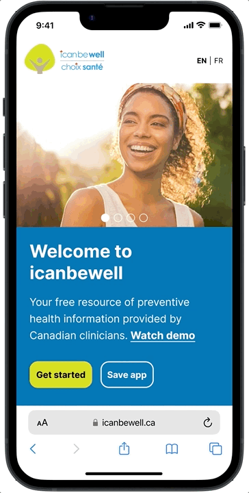
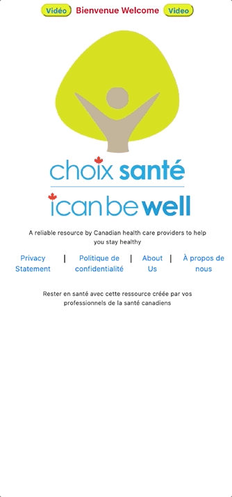
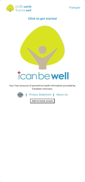
Landing Page
This page features the logo, app description, and links to the privacy policy, about us, and a welcome video, all in English and French. Clicking “choix santé” directs users to the French version, while selecting “icanbewell” takes them to the English version of the application.
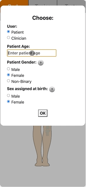
User and Patient Details Page
Users must select their role (patient or clinician) and enter the patient details. The application displays curated information based on the user's type, age, sex, and sex assigned at birth. New users or returning users in a new session will be prompted to accept the terms of use.

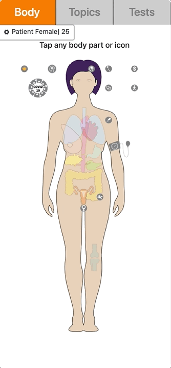
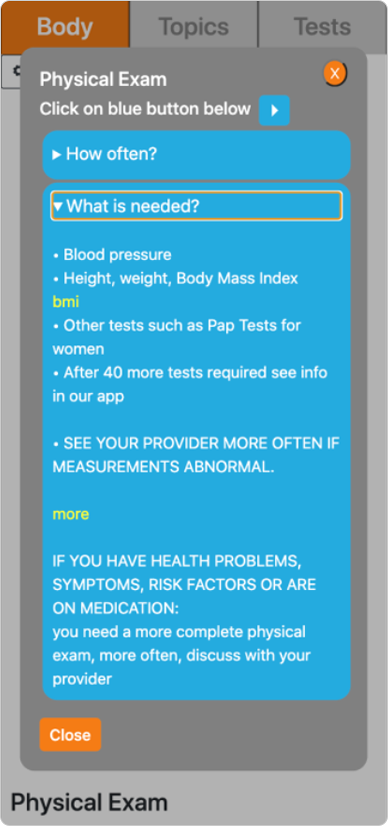
Body Page
This page shows a human body image (male, female, or non-binary) based on patient details. Users can click icons or organs to access related information and links. They can navigate to the Topics and Tests pages via tabs at the top, and update user role and patient details by clicking the button below the tabs.

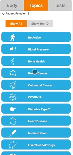
Topics Page
This page lists preventive health topics. Users can view all topics by clicking "Show All" or see the top 10 by clicking "See Top 10." They can navigate to the Body and Tests Pages via the top tabs and update user role and patient details using the button below.

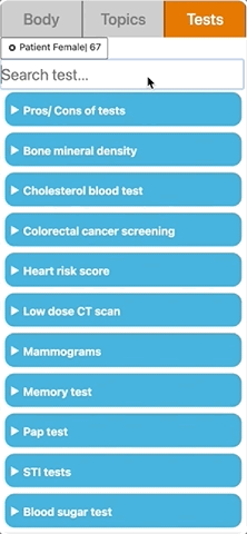
Tests Page
This page provides information on various health tests and allows users to search for specific tests. Users can access the Body and Topics Pages via the top tabs and update user role and patient details using the button below.
Uncovering usability issues
UX AUDIT
To better understand how the current version of the app works and identify usability challenges, I conducted an evaluation based on Jakob Nielsen’s 10 Usability Heuristics. In addition to heuristic analysis, I also assessed the app’s accessibility and readability to ensure a better user experience. The key issues uncovered are shown below.
-
![]()
1. Visibility of system status
On the Body Page, even after closing the organ modal, the organ title continues to be shown and the colour does not go back to default, not giving appropriate feedback to users about what is happening in the system and where they are.
Recommendations:
— Remove the organ title at the bottom of the page
— Change the organ colour to default when modal is closed
-
![]()
2. Match between system and real world
The Landing Page visual hierarchy focuses too much on the logo and just from the name “icanbewell”, users might not understand what the app is about. Moreover, there is no clear indication of where users should click to start using the app.
Recommendations:
—Reorganize the Landing Page to clearly convey the goal of the app and how it can be used
— Add CTA (button) where users click to start using the app
-
![]()
3. User control and freedom
After selecting the language, there is no button to go back to the Landing Page, so users are not able to leave unwanted actions such as selecting the wrong language. On the Body Page, modals have two close buttons, but redundancy is not necessary in this case.
Recommendations:
— Add back button
— Keep modals close button at the top, so it is visible both when options are closed and expanded
-
![]()
4. Consistency and standards
On the Body and Topics Pages, icons are not keeping internal consistency (different sizes and styles). The logo is icanbewell, but the URL remains canbewell. The logo colours were not consistently applied throughout the interface. As a mobile-first web app, users might be more familiarized with a hidden side menu instead of tabs.
Recommendations:
— Keep icons consistent, either solid or outlined and the same size
— Change URL to icanbewell and change the colour palette for consistency with the logo
— Change menu from tabs to hidden side menu
-
![]()
5. Error prevention
On the Tests Page, search results are filtered as users type, which can make users more prone to error. Users might forget the correct spelling of a test and not find what they need. On the User and Patient Details Page, the patient's age should be a number between 18 and 150, but there is no indication of that.
Recommendations:
— Add a search button (icon) beside the search bar
— Show search results only after the search is performed
— Add a placeholder in the patient age field to specify the age range
-
![]()
6. Recognition rather than recall
On the Body Page, users find out what each icon means after clicking on them or if they remember from their past interactions with the app. However, to reduce user memory load, they should not need to remember what each icon means.
Recommendations:
— Add icon labels (and ideally organ labels, but that is not feasible with the current Body Page layout)
— Add a search history to the Tests Page (would require users to have an account)
-
![]()
7. Flexibility and efficiency of use
The Top 10 topics shown on the Topics Page are based on the patient's age, gender and sex assigned at birth. However, there might be outlier cases, such as a young person with a special heart condition who needs to access the heart disease topic more frequently.
Recommendation:
— Allow users to select their own Top 10 topics based on their needs (would require users to have an account)
-
![]()
8. Aesthetic and minimalistic design
The Landing Page contains too much information and some pieces of information are rarely needed. The lack of correct spacing in the app and the colours used compete for users’ attention and decrease visibility. The app does not have a brand visual identity.
Recommendations:
— Redesign the landing page focusing on what is essential
— Create a brand identity
— Redesign the app to incorporate the colour palette and improve visibility and navigation
-
![]()
9. Help users recognize, diagnose and recover from errors
On the User and Patient Details Page, the error message “Please select a gender and age between 18 and 150” is confusing and does not appear close to the age field. Additionally, when no results are found, the Tests Page does not show an error message. Instead, users are redirected to the Landing Page.
Recommendations:
— Change the error message to “Select an age between 18 and 150” and place it near the age field
— Change the age field border to red to indicate where the error occured
— Add error message to Tests Page when no results are found and do not redirect users
-
![]()
10. Help and documentation
Users might get confused when using the app for the first time. Although there is a welcome video on the Landing Page, some users might not see it. Hence, an in-app guide would be helpful as part of the onboarding experience.
Recommendation:
— Create an in-app guide that highlights the app functionalities with a brief explanation
-
![]()
Beyond Heuristics: Accessibility
The colour palette used throughout the app is not accessible. The contrast between the blue (#25AAE1) and white does not meet WCAG AA standards. Similarly, the grey on grey tabs, and the white on orange (#F57C15) also lacked sufficient contrast, making them innacessible.
Recommendations:
— Recreate the colour palette, replacing low-contrast colors with accessible alternatives
— Update the accent colour for accessibility and consistency with logo
-
![]()
Beyond Heuristics: Readability
Many modal texts are too long, reducing clarity and user-friendliness. Spacing and indentation issues in modals further impact comprehension, leading users to group information incorrectly. Additionally, tooltips use bolded text, decreasing readability.
Recommendations:— Standardize text formatting in modals
— Fix indentation and spacing to improve clarity and logical grouping
— Shorten content to make information cleare, and user-friendly


Learning about the users
RESEARCH
Dr. Cleo is a family doctor and is often doing presentations across Canada, in which she showcases icanbewell. Hence, she has direct contact with all types of users: doctors and patients and was able to share with me data on those users. Aiming to learn more about the users and how they interact with the icanbewell application, I interviewed the client, Dr. Cleo, and analyzed the secondary data she provided.
Through the interview I:
— validated the heuristic evaluation findings and my recommendations to fix the usability issues
— prioritized the recommendations based on Dr. Cleo’s needs and vision for the app
— learned more about the users and the context in which they use the application
— understood Dr. Cleo’s needs and pain points as the medical expert
Defining the different types of users
USER PERSONAS
Based on the user data, I have created 3 personas to represent the different icanbewell users. These will help the team better understand who our users are and serve as a reference point, ensuring that every iteration of the product remains aligned with user needs and pain points.
“I need to stay up to date with preventive health information and guidelines”
Archie, Family doctor

Frustrations
— Feels healthcare information is always changing
— Information is scattered across the web
— Hard to keep up with preventive health information
Goals
— Wants to quickly be updated to give the right information to patients especially considering time during primary care visits for preventive health is limited
“It’s difficult to find preventive health info tailored to non-binary and transgender people.”
Oliver, Transgender patient
Frustrations
— Feels that transgender people do not have equal preventive health access when compared to cisgender adults
— It is hard to know at first if a preventive health tool is actually inclusive
— Has a hard time remembering what tests he needs to do
Goals
— Wants to stay healthy
— Wants to have a clear understanding of preventive tests he needs to do as a trans man

Frustrations
— No adequate health literacy
— Not an organized person and feels it is hard to find preventive health information
— Preventive health tools look complex, difficult to understand and cramped with information
Goals
— Wants to stay healthy
— Wants to understand more about preventive health
— Wants to do preventive tests based on family history
“I want to make sure I can stay healthy, especially considering common diseases in my family”
Chantal, French-speaking patient

By creating user personas it was possible to build a more consolidated view of the different user groups that use icanbewell. The main takeaways uncovered through the personas are:
— Transgender patients have a hard time finding preventive health information tailored for them, so the application must look inclusive, inviting and tailored to everyone from the Landing Page, to motivate people to use the app
— Patients want to know what type of tests they must do and when so an idea for the future would be to have a test calendar specific for each user and to send them notifications when the test date is approaching (would require users to have an account)
— Doctors are very busy, so the app must be very organized to help them quickly find the information they need without much effort
— Many patients using the app do not have adequate health literacy and feel overwhelmed when looking for preventive health information, therefore icanbewell must look friendly, straightforward and easy to use and find information
Key takeaways
Understanding the journey each persona goes through
USER JOURNEY MAPS
Based on the secondary data analyzed, I also created user journey maps for each of our personas to better understand their points of interaction with the app and how they feel at each stage of the interaction. With the journey maps, I started thinking about opportunities to solve the pain points each persona faces and, consequently, improve the application.
— Work with an SEO specialist to improve SEO and help icanbewell (EN ver.) be indexed higher in results
— Improve User and Patient Details Page to avoid confusion and clearly distinguish which fields require patients’ information
— Include tootip besides “all ages” option in the User and Patient Details Page to clarify how it can be used
— Remove dynamic search results and include message if no results are found to avoid confusion
Key takeaways
— Work with an SEO specialist to improve SEO and help choixsante (FR ver.) be indexed higher in results
— Add information on the app purpose and usage on hompeage to improve clarity and user onboarding
— To improve clarity and ensure informed consent, the terms of use should be presented on a separate page before any information is entered
Key takeaways
— Considering navigation clarity, users should be able to easily switch between language versions and return to the Landing Page
— Content should be refined and formatted to better fit mobile screens and improve legibility and readability
— When closing a pop-up modal, the body organ should return to its default color state to avoid confusion and ensure an intuitive user experience
Key takeaways
Next steps: actionable recommendations
After synthesizing the insights from the heuristic evaluation, secondary research, client interview, user personas, and journey maps, I created a comprehensive document outlining the suggested changes for improving the app's usability and overall user experience. These recommendations were categorized into high-priority and future changes, serving as a roadmap for future iterations of icanbewell.
Creating a brand visual identity
BRAND IDENTITY
Initially, the app lacked a cohesive brand identity, so I focused on rethinking the colour palette, logo and imagery to incorporate the brand identity into the app.
To address the accessibility and consistency issues uncovered during the UX audit, I recreated the colour palette, replacing the primary brand colour with an accessible alternative and updating the accent colour to one from the logo for better consistency.
Colour Palette

Original

New
Separating the app’s Landing Page into the English and French pages was one of the client’s highest priorities, so it was important to have a different logo version for each page.
Logo

Moreover, to make the Landing Page more friendly and allow users to feel represented, I decided to add a banner with different images representing the people that might use icanbewell. The images should show people from different ethnicities and in different age groups smiling to convey the idea that the app is for everyone and that, with the app, people can stay healthy and live happily. Hence, I separated some sample images to use in the new UIs I designed.
Imagery


Turning insights into a (re)design solution
IDEATING
Considering the issues uncovered through the research and user journey maps, I then created wireframes of the redesigned app. The current version of icanbewell is shown on the left, while the designs I proposed are shown on the right. It is worth noting that for all screens, I created both an English and French versions.
Landing page before


Too much info competing for users’ attention, not everything is essential
No clear indication of how to start using the app
Landing page after
Image carousel to make the landing page friendly and inclusive
Included policy, about and contact info on the footer, only visible when scrolling the page
Separated the landing page into two pages: English and French
Used hierarchy to convey the message of what the app is about and added a call to action
User and patient details page before
Not clear what should be user info and what should be patient info
Terms of use are shown on the same page, but users cannot accept the terms unless they have already filled the form
User and patient details page + Terms of use page after
Added a button to allow users to go back to the landing page
Organized information to increase visibility and readability
Separated the terms of use from the user and patient details form
Created different sections to help users visually distinguish user input fields from patient input fields
Body page before
Lack of proper spacing, decreasing visibility
Icons are not labeled and are inconsistent in style and size
Tabs are used to navigate between the different pages
Body page after
Created a structure for all pages with a heading and subheading to help users locate themselves and understand how to interact with each page
Icons are labeled, the same size and symmetrically displayed
Added a hidden side menu, accessible on all pages, allowing users to navigate between the 3 content pages and the landing page
Topics page before


Tabs are used to navigate between the different pages
Top 10 is the second option, but when users select the topics tab the top 10 topics are shown first
Topics page after


Top 10 is now the first option
Follows the same page structure created
Hidden side menu for easy navigation
Tests page before
Tabs are used to navigate between the different pages
No search button, results are updated as users type
No error message, if no results are found, users are redirected to the landing page
Tests page after

Follows the same page structure created
Results are shown only after users click on the search icon or the enter key on their keyboard
Clear error message to help users understand and recover from errors
Hidden side menu for easy navigation
Testing the usability of the first UX iteration of icanbewell
PROTOTYPING & TESTING
After designing the wireframes, I created prototypes and tested them. Access the testing protocol here↗
Exploratory
The goal of the test was exploratory, to help us get the participants’ opinions and see their impressions of the redesigned app
Participants
6 participants tested the prototypes, two family doctors and 4 patients (non-medical)
Unmoderated
The test was remote and unmoderated, giving participants flexibility to do the test when most convenient, considering their busy schedules
Qualitative
I created a testing protocol to guide participants and focused on qualitative answers that would give us a richer feedback
While a couple of participants had never used icanbewell before, the others knew what the current version of icanbewell looked like. Either way, all participants found the redesigned app is straightforward and easy to navigate. Moreover, they found the reduction of text, especially on the landing page by splitting the English and French pages, was beneficial and made the app more inviting and modern. The participants that had already used icanbewell pointed out the new designs look clearer and said they liked the use of photos on the landing page instead of only graphics. Most participants said the app looks professional and credible, which could eventually lead to higher user adoption and retention.
Some great suggestions for new features and content include:
— Diets: adding information on different diets and linking it to different topics such as nutrition, physical activity and blood pressure
— Cultural background: asking users’ cultural background, as there are some diseases specific to or more common in certain cultural groups
— Inclusivity: using photos of overweight people, first nations, physically handicapped, etc. to increase inclusivity
— Icon recognition: replace some icons that are not easily recognizable
Key insights from testing
Next steps and lessons learned
REVIEW
In the short term, the next step would be to analyze all the ideas suggested by the participants to decide which ones will be implemented in the app. Additionally, a more robust prototype could be created to allow for more thorough testing. Finally, after the necessary changes are made, the new designs will be deployed.
With this project, I learned how important it is to make sure the team is on the same page and understands the importance of UX, especially when the project did not have a UX focus from the start. By communicating and explaining the design decisions and the reasoning behind them, I was able to build more trust with the stakeholders and make sure the whole team adopted a user-centered mindset.
As I leave this project, I am confident that the work I did goes beyond just redesigning the icanbewell application, as it created a shift in the team that will be essential to continuously improve the user experience and will help shape the future of icanbewell.
Want to read more?

Grandma Tech
Teaching the elderly how to use mobile apps through gamification

Amazon 🔒
Designing a Planner Tool for Amazon while working as a UX Designer at Athlon Studio

HomePeace
Helping roommates to live together more peacefully